Choosing colors for generative art with HSL, not RGB
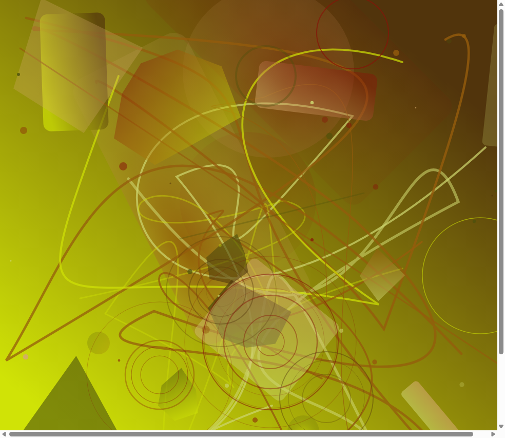
My first attempts at generative art produced colors that physically hurt to look at. The problem wasn't randomness — it was that I was picking RGB values straight from a random number generator. RGB is how screens display color, but it's a terrible interface for design decisions. Want a "slightly warmer" version of a color in RGB? You'd be guessing at how much red to add and blue to remove. Want a pastel palette? Good luck computing that across three channels.
HSL (Hue, Saturation, Lightness) maps directly to how people actually think about color. Once I switched my generative pipeline to think in HSL and only convert to RGB at the very end, every palette stopped looking like noise. This post is the mental model I wish I'd had, the five classic harmonies, and the Python that makes them repeatable — including how we feed quantum randomness into the whole thing for the Quantum Genesis collection.
Why HSL wins
RGB gives you 16.7 million combinations with no intuition for what they'll look like together. HSL splits color into three thinkable dimensions:
- Hue (0-360): the color itself — red, orange, yellow, green, blue, purple. It's a circle.
- Saturation (0-100%): how vivid versus gray. 100% is pure color, 0% is grayscale.
- Lightness (0-100%): how bright versus dark. 0% is black, 100% is white, 50% is pure color.
Now "slightly warmer" means +10 on the hue wheel. "Pastel" means saturation 40-60% and lightness 70-85%. Simple, predictable, programmable.
> Rule of thumb: use RGB for rendering, HSL for thinking. Convert at the last moment.
Hue, saturation, lightness
Hue is a circle — 0 and 360 are both red. The landmarks:
| Degrees | Color | Hex |
|---|---|---|
| 0 | Red | #FF0000 |
| 30 | Orange | #FF8000 |
| 60 | Yellow | #FFFF00 |
| 120 | Green | #00FF00 |
| 180 | Cyan | #00FFFF |
| 240 | Blue | #0000FF |
| 270 | Purple | #8000FF |
| 300 | Magenta | #FF00FF |
Because hue is circular you can rotate freely: +180 gives the complement, +120 starts triadic colors. That circularity is the foundation of every harmony.
Saturation controls intensity. In generative art, the ranges set the mood:
- 80-100%: bold, energetic, pop art feel
- 50-70%: rich but natural, the most versatile range
- 20-40%: muted, sophisticated, editorial
- 0-15%: nearly monochrome, minimal
Lightness controls tonal value. Useful sweet spots:
- 85-95%: pastels (with medium saturation)
- 60-75%: bright, readable colors
- 40-55%: mid-tones, the most "colorful" range
- 15-30%: deep, rich tones (jewel tones with high saturation)
The five color harmonies
Harmonies are mathematically defined relationships on the hue wheel that produce pleasing combinations.
Complementary (180° apart). Two colors directly opposite. Maximum contrast, high energy. Red/cyan, blue/orange, purple/yellow. Best for bold designs and focal points — use one color dominant (70%) and the complement as accent (30%).
Analogous (±30°). Three adjacent colors. Harmonious, natural, easy on the eyes. Blue/blue-purple/purple, yellow/yellow-green/green. Best for serene, cohesive compositions; very low risk of clashing.
Triadic (120° apart). Three colors equally spaced. Balanced, vibrant, playful. Red/yellow/blue (primary), orange/green/purple (secondary). Best when one color dominates and two accent.
Split-complementary (150° and 210°). One base color plus the two adjacent to its complement. Nearly as much contrast as complementary but less tension. Blue + yellow-orange + red-orange. Great for beginners — hard to mess up.
Tetradic (rectangle: 60, 180, 240°). Four colors forming a rectangle. Rich, complex palettes with lots of variety, e.g. red + yellow + cyan + blue. Best for complex generative art; let one color dominate or it gets chaotic.
The Python
First, HSL to RGB conversion:
import colorsys

def hsl_to_rgb(h, s, l):
    """Convert HSL to RGB.
    h: 0-360 (degrees)
    s: 0-100 (percentage)
    l: 0-100 (percentage)
    Returns: (r, g, b) each 0-255
    """
    h_norm = h / 360.0
    s_norm = s / 100.0
    l_norm = l / 100.0
    r, g, b = colorsys.hls_to_rgb(h_norm, l_norm, s_norm)
    return (int(r * 255), int(g * 255), int(b * 255))

def rgb_to_hex(r, g, b):
    """Convert RGB to hex string."""
    return f"#{r:02x}{g:02x}{b:02x}"

# Example:
color = hsl_to_rgb(210, 80, 55)   # Vivid blue
print(rgb_to_hex(*color))          # #1c6fdb
Then the five harmony generators:
def complementary(base_hue):
    """Return 2 hues: base and its complement."""
    return [base_hue, (base_hue + 180) % 360]

def analogous(base_hue, spread=30):
    """Return 3 adjacent hues."""
    return [
        (base_hue - spread) % 360,
        base_hue,
        (base_hue + spread) % 360
    ]

def triadic(base_hue):
    """Return 3 equally-spaced hues."""
    return [base_hue, (base_hue + 120) % 360, (base_hue + 240) % 360]

def split_complementary(base_hue, spread=30):
    """Return 3 hues: base + two near the complement."""
    comp = (base_hue + 180) % 360
    return [base_hue, (comp - spread) % 360, (comp + spread) % 360]

def tetradic(base_hue):
    """Return 4 hues forming a rectangle."""
    return [
        base_hue,
        (base_hue + 60) % 360,
        (base_hue + 180) % 360,
        (base_hue + 240) % 360
    ]
Raw harmony hues are just the skeleton. A usable palette needs saturation and lightness variation for depth:
import random

def generate_palette(harmony_hues, num_colors=5, seed=None):
    """Generate a full palette from harmony hues with S/L variations."""
    if seed is not None:
        random.seed(seed)

    palette = []
    for i in range(num_colors):
        hue = random.choice(harmony_hues)
        # Add small hue variation (±10 degrees)
        hue = (hue + random.uniform(-10, 10)) % 360
        # Saturation: biased toward vivid
        sat = random.uniform(55, 95)
        # Lightness: avoid extremes (too dark / too light)
        lit = random.uniform(35, 75)
        rgb = hsl_to_rgb(hue, sat, lit)
        palette.append({
            'hsl': (round(hue), round(sat), round(lit)),
            'rgb': rgb,
            'hex': rgb_to_hex(*rgb)
        })

    return palette

# Generate a triadic palette:
hues = triadic(base_hue=220)    # Blue-based triadic
palette = generate_palette(hues, num_colors=6, seed=42)
for c in palette:
    print(f"  {c['hex']}  HSL({c['hsl'][0]}, {c['hsl'][1]}%, {c['hsl'][2]}%)")
For backgrounds, clamp lightness to either very dark (10-20%) or very light (85-95%), and drop saturation to 15-30%. That keeps the generative elements popping against the backdrop:
def generate_background(base_hue, dark=True):
    """Generate a subtle background color from the palette's base hue."""
    hue = (base_hue + random.uniform(-15, 15)) % 360
    sat = random.uniform(15, 30)
    lit = random.uniform(8, 18) if dark else random.uniform(88, 96)
    return hsl_to_rgb(hue, sat, lit)
Quantum randomness meets color theory
In the Quantum Genesis collection we don't use random.random(). Every random decision comes from measurements on real quantum computers — IBM Quantum's ibm_fez (156 qubits) and Origin Quantum's WK_C180 (180 qubits). Here's how a run of quantum bits becomes a palette:
# Simplified from our actual quantum_nft_generator.py

def quantum_bits_to_palette(quantum_hex_seed):
    """Convert quantum measurement hex string to color palette."""
    # Parse quantum seed (64 hex chars = 256 bits)
    seed_int = int(quantum_hex_seed, 16)

    # Extract base hue from first 9 bits (0-511 → mod 360)
    base_hue = (seed_int >> 247) % 360

    # Extract harmony type from next 3 bits (0-7 → 5 types)
    harmony_bits = (seed_int >> 244) & 0x7
    harmony_types = [
        complementary, analogous, triadic,
        split_complementary, tetradic
    ]
    harmony_fn = harmony_types[harmony_bits % 5]

    # Generate harmony hues
    hues = harmony_fn(base_hue)

    # Use remaining bits as seed for variations
    variation_seed = (seed_int >> 200) & 0xFFFFFFFF
    palette = generate_palette(hues, num_colors=6, seed=variation_seed)

    return palette, harmony_fn.__name__
The key insight: color theory provides the structure, quantum randomness provides the exploration. Without color theory, random colors look like noise. Without quantum randomness, palettes are predictable. Together you get harmonious yet genuinely unique combinations.
> Each of the 100 Quantum Genesis pieces has a unique quantum-derived color palette that's mathematically harmonious but physically irreproducible. The specific quantum noise from the exact moment of measurement can never be recreated.
The harmony type is recorded in each piece's metadata as an on-chain attribute, so you can filter by "Triadic," "Complementary," and so on.
Practical tips for your own projects
- Start with HSL, always. Even if your rendering library takes RGB, think in HSL first.
- Limit your palette to 4-6 colors plus background. More than that and compositions get muddy.
- Vary lightness more than saturation. Tonal contrast is more impactful than saturation contrast.
- Test against dark and light backgrounds. Your palette should work on both.
- Use harmony type as metadata. It's a meaningful, human-readable trait for generative collections.
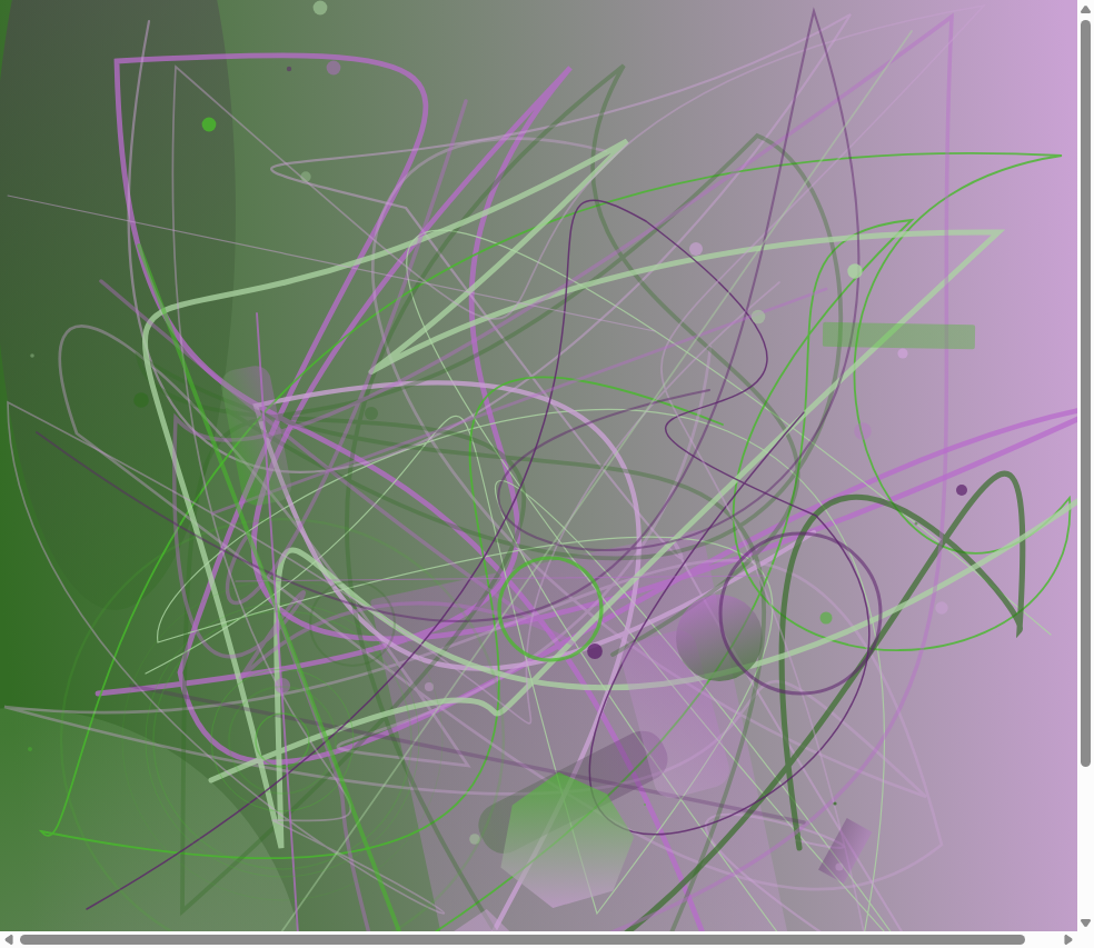
Color theory gives generative art its structure; the randomness gives it life. Once you separate the two responsibilities — structure in HSL, exploration in measurement — palettes that used to look like static start to look like intentional art.


Comments
Post a Comment